Content Creator Education Hub
Overview
This project aimed to improve discoverability and usability for a large-scale content creator education platform used by influencers and selling partners. The client’s previous site had grown disorganized and inconsistent over time, with various contributors creating pages using different layouts and design approaches.
As Lead UX Designer, I was responsible for redefining the site’s structure and designing a unified, scalable experience. Working alongside one visual designer and two content strategists, I led all information architecture and wireframe design, ensuring the platform could serve multiple creator types with clarity and consistency.

Information Architecture
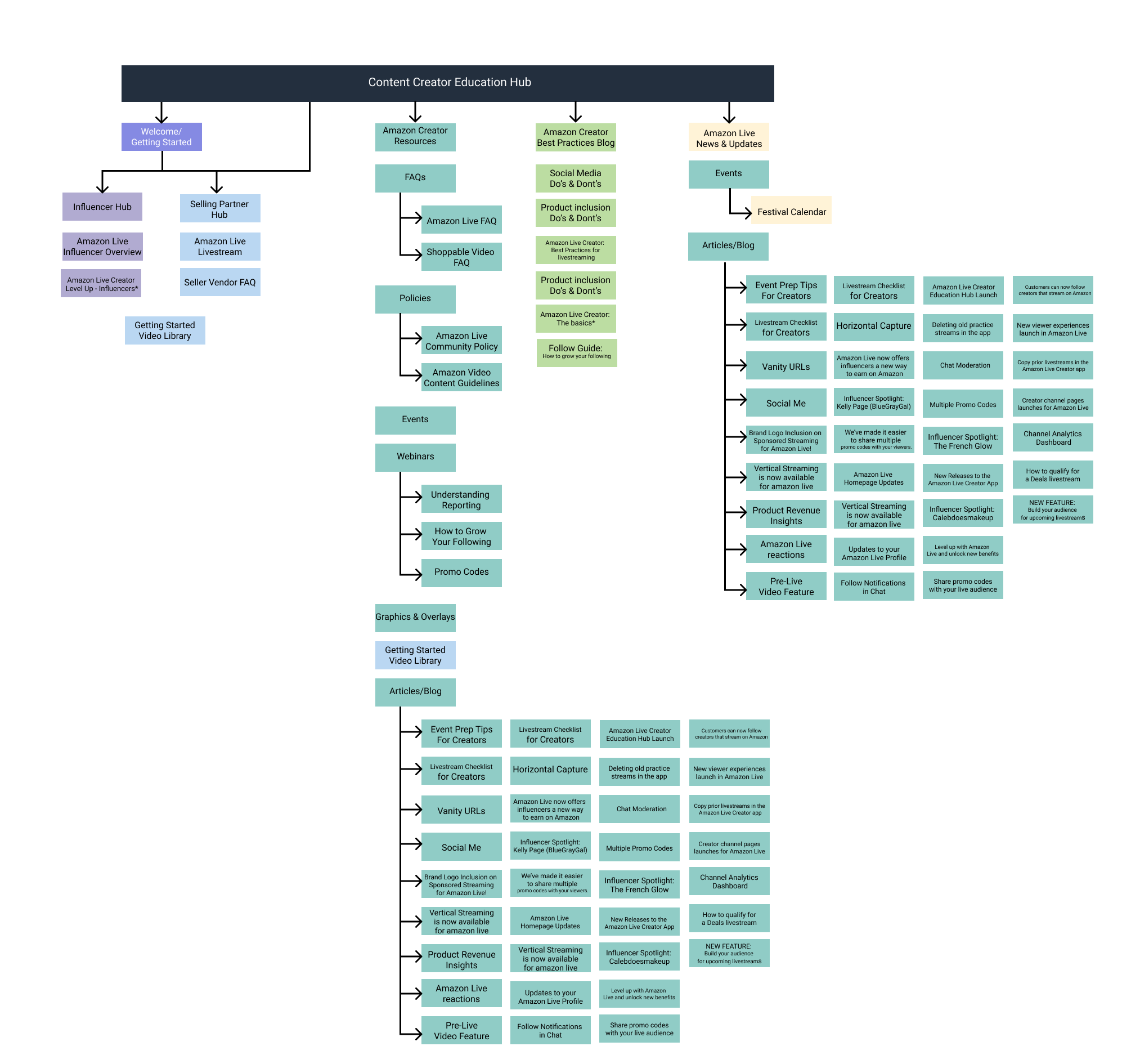
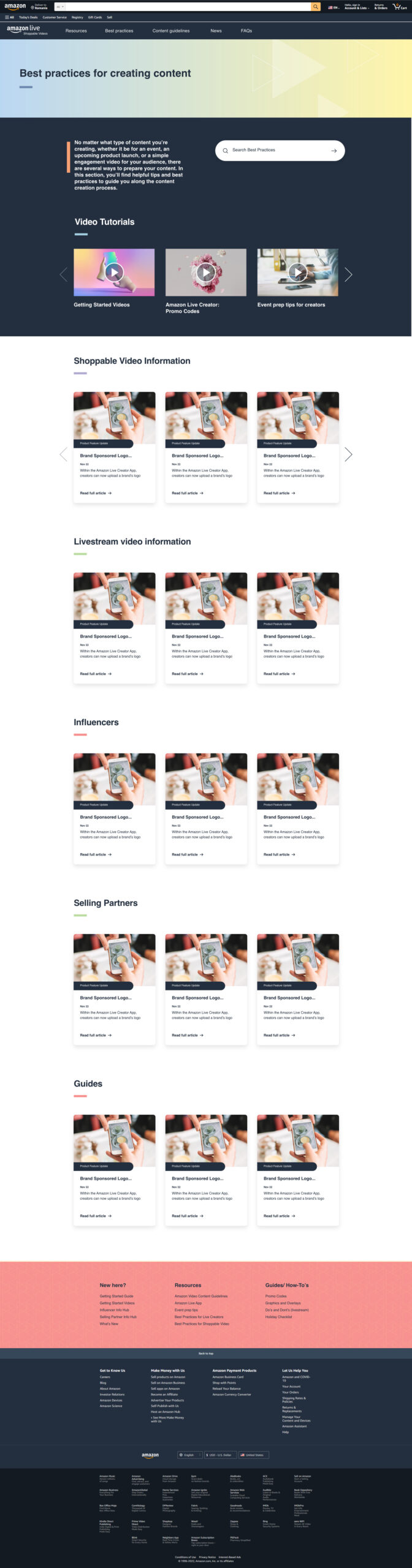
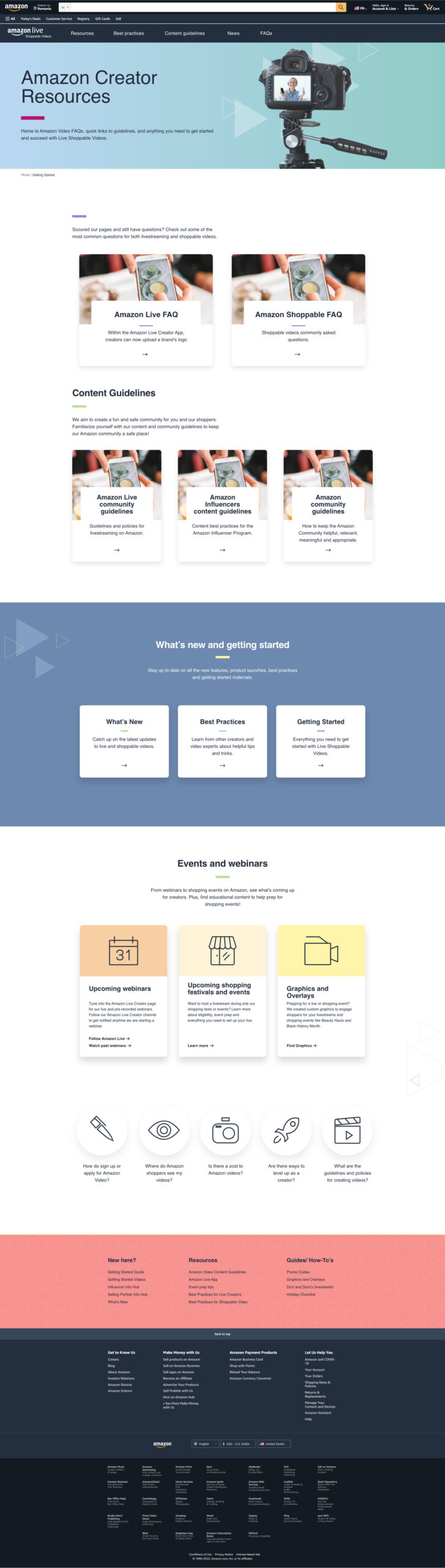
The existing site housed valuable educational materials but lacked a clear way for users to find what they needed. Resources were scattered across an outdated, text-heavy interface.
I conducted a full audit of the content ecosystem and collaborated closely with the content team to streamline how information was grouped and accessed. The new modular IA organized resources by both persona (influencers vs. selling partners) and learning category (such as best practices, tutorials, and policies).
This structure created logical entry points for each user type, helping them move from “getting started” to “growing their brand” in a guided, intuitive way.
Wireframes & Templates
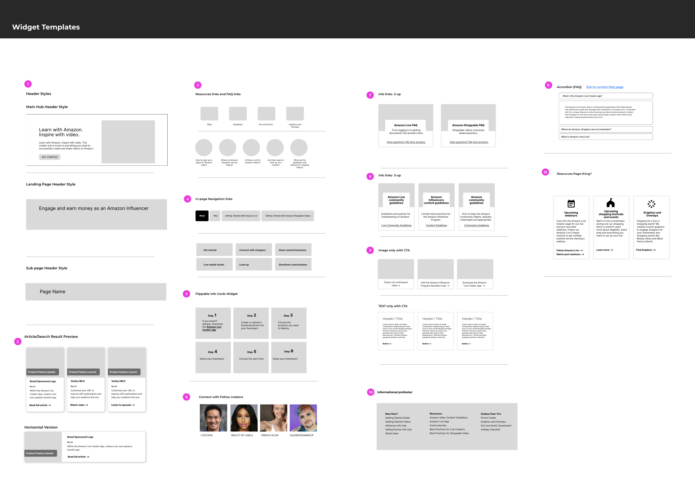
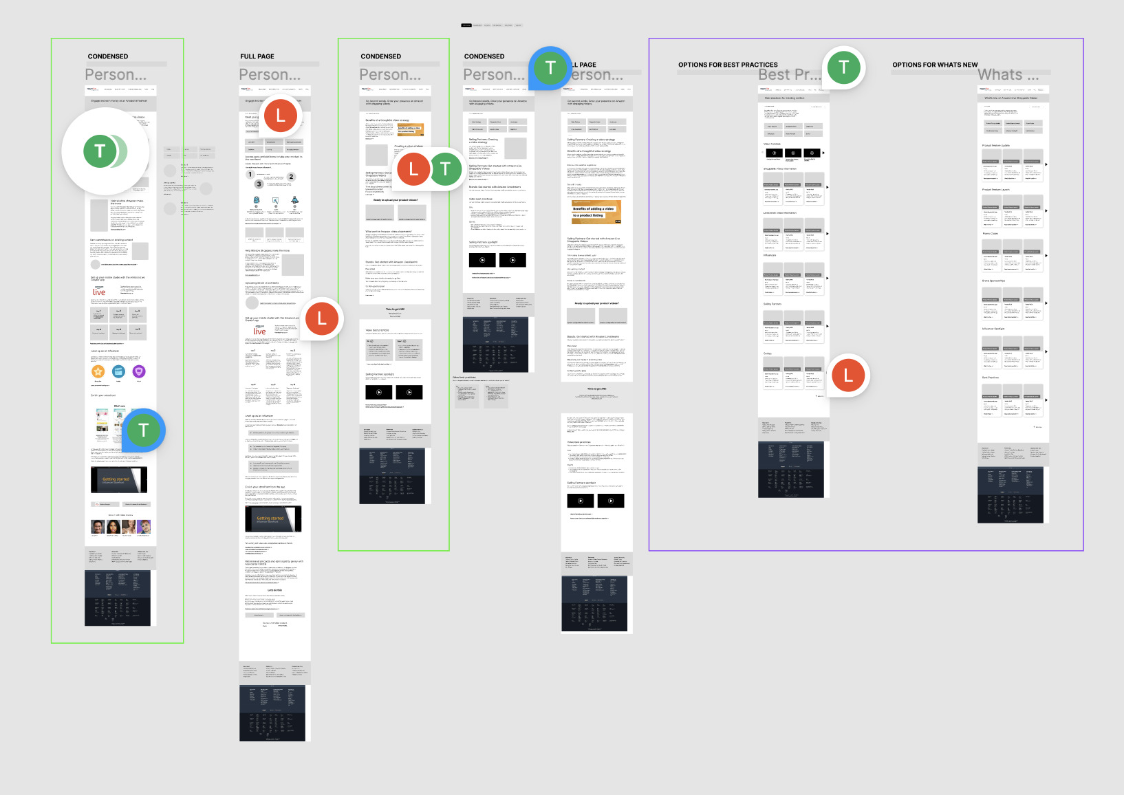
Given the platform’s technical limitations within Amazon’s internal CMS, flexibility was a core design challenge. I created a library of reusable widget templates to help developers build new pages consistently while giving content editors autonomy to publish updates without breaking the design system.
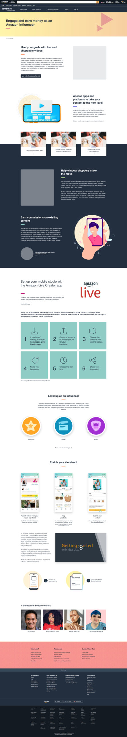
The responsive desktop-first wireframes emphasized visual hierarchy, quick scanning, and discoverability — matching how most creators accessed and interacted with the platform on laptops.
Each module was carefully documented to ensure ease of implementation, supporting everything from video tutorials and FAQs to promotional events and success stories.
Outcome
Hey there, this is the default text for a new paragraph. Feel free to edit this paragraph by clicking on the yellow edit icon. After you are done just click on the yellow checkmark button on the top right. Have Fun!
The new experience provided a cohesive, branded education hub that empowered both influencers and selling partners to learn, grow, and connect more effectively. The redesign gave internal teams a consistent framework for managing and expanding content, solving one of their biggest frustrations: the lack of visual and structural uniformity.
Stakeholders praised the clarity and scalability of the new system. Even an initially skeptical project lead became a strong supporter after seeing how streamlined and flexible the structure was in practice. The site now serves as the central educational resource for creators, helping them navigate the tools, best practices, and programs available on the platform.
Role & Deliverables
Role: Lead UX Designer
Deliverables: Information Architecture, Wireframes, Widget Templates
Selected Works
Mutual of America SharePoint RedesignUX/UI Design
Content Creator Education HubUX/UI Design
For Oregon StateUX for Website Merge