Mutual of America SharePoint Redesign
Overview
Mutual of America’s team had previously attempted several intranet reorganizations and trusted our UX expertise to create a system that finally worked. I led information architecture, accessibility, and design collaboration through to launch — helping transform a dense, fragmented structure into an organized, on-brand digital workplace.
Role: UX/UI Designer
Platform: SharePoint (Brand Center + Custom Fonts)
Timeline: Discovery → Launch Support
Challenge & Discovery
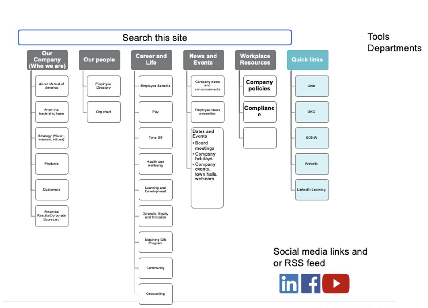
For me this proiject began with discovery and then diving right into Information Architecture. The client gave us a LOT of documentation from their previous attempts to organize their intranet. They fully trusted our expertise to create something that was organized and user-friendly.
The image on the left is a pad that Mutual of America took at redesigning their own Information Architecture Document for their new SharePoint Intranet.
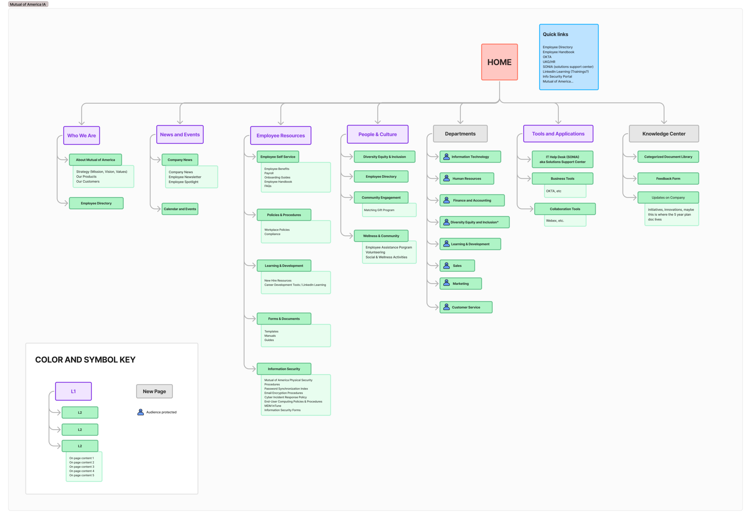
Information Architecture
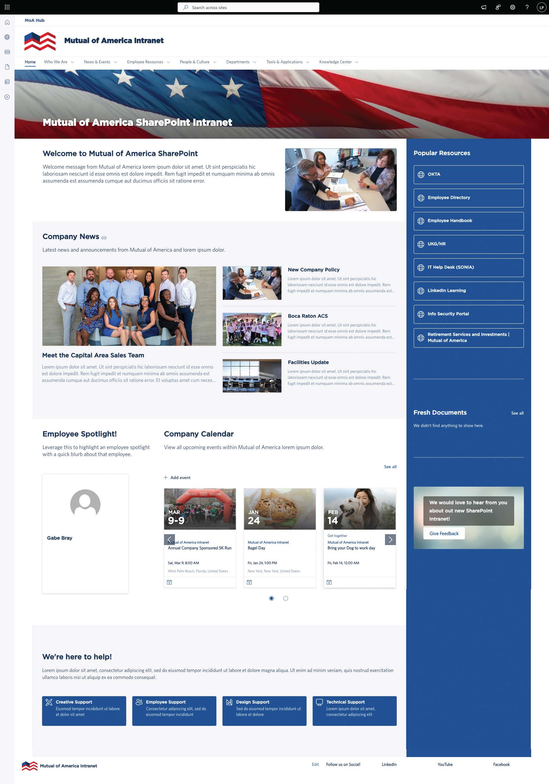
I created a new IA built on a self-service model, prioritizing employee tools, HR resources, and quick access to news and announcements.
The hierarchy was organized around two core user goals:
- “What resources do I need for my job?”
- “What’s happening across my organization?”
Wireframes & Layout Concepts
Early homepage and HR page wireframes focusing on news hierarchy, employee engagement, and visibility of key tools.
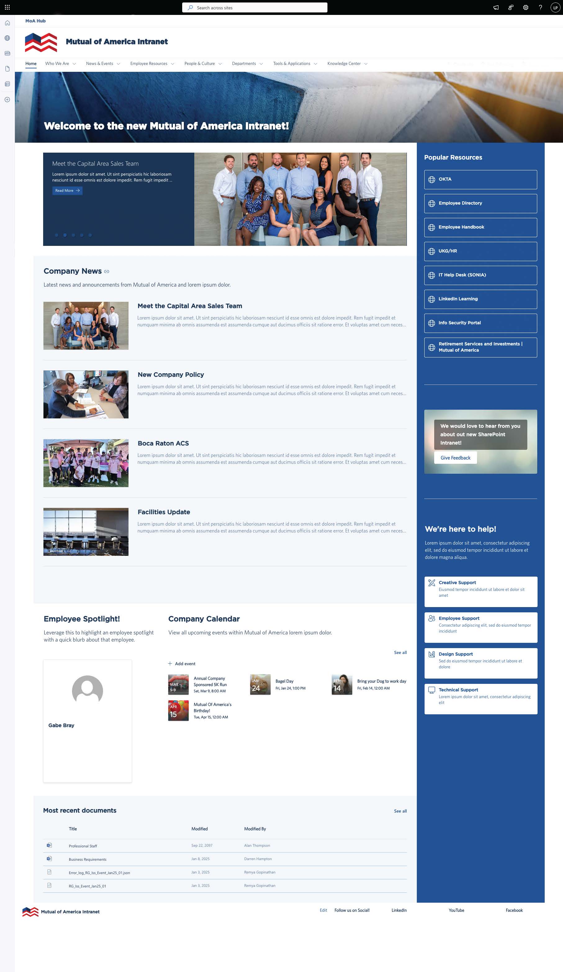
Visual Collaboration & Brand Customization
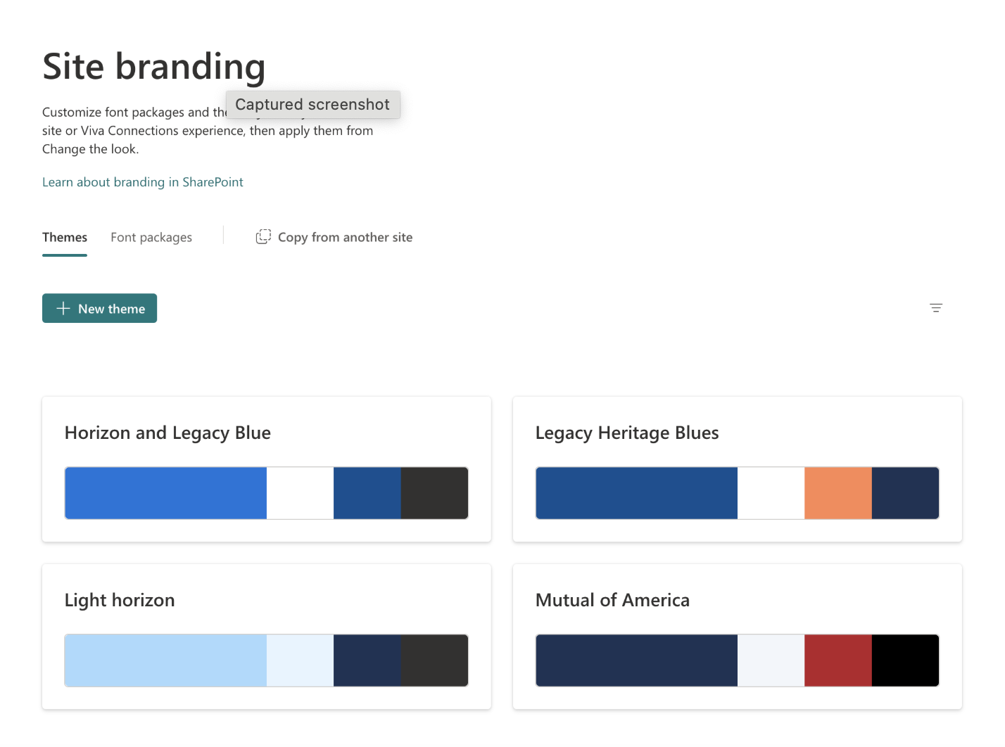
This project was the first SharePoint site where I implemented Brand Center customizations — including a branded font and unique sidebar color. The client was deeply invested in the visuals, so I collaborated closely with their internal designer to create banner graphics and refined layouts that fit their tone and culture.
Accessibility & Launch Support
I ensured every page and banner met WCAG 2.1 AA standards for contrast and readability. I also extended my engagement beyond design handoff to support the content and development team during build — adjusting layouts, testing page structure, and ensuring a polished, consistent experience at launch.
Outcome
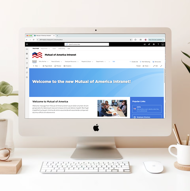
The new Mutual of America intranet launched to strong employee feedback. The site reflected the company’s professionalism and people-first culture — organized, accessible, and visually cohesive.
This project remains one of my favorites because it balanced structure, design, and collaboration all the way through delivery.

Selected Works
Mutual of America SharePoint RedesignUX/UI Design

Content Creator Education HubUX/UI Design

For Oregon StateUX for Website Merge